THE SHORT ANSWER
Your homepage’s job is to route each visitor to the next step that matches why they showed up, not to close a sale in one shot. Get that wrong and you lose people in the half second it takes them to judge whether your site is even relevant . Get it right and the homepage becomes the single highest-leverage page on your site for lead capture.
Your homepage’s job is to route each visitor to the next step that matches why they showed up, not to close a sale in one shot. Get that wrong and you lose people in the half second it takes them to judge whether your site is even relevant. Get it right and the homepage becomes the single highest-leverage page on your site for lead capture.
Three things to fix first, before anything else on this page:
Name the audience in the headline. If a visitor can’t tell in one glance whether you serve businesses like theirs, they bounce before reading a word further.
Offer at least two or three next steps, not one. A single “Book a Demo” button forces everyone into the same commitment level, and most visitors aren’t ready for it.
Pass the 5-second verdict test. Show the page to someone unfamiliar with your business for five seconds, then ask what you do and who you do it for. If they hesitate, your hero section is broken.
The elements that actually move the needle on lead capture are fewer than most redesign briefs suggest:
A headline that names the buyer, not just the category
An above-the-fold primary call-to-action tied to your main offer
At least one lower-commitment secondary path (a calculator, a guide, a chat)
Visible proof (logos, review counts, a specific result) within the first screen
A form or chat entry point that asks for the minimum information needed to follow up
Pro Tip: Before you touch a single button color, read your homepage’s first 100 words out loud. If they could describe five other companies in your industry, you have a messaging problem, not a design problem.
Key Takeaways
The homepage’s core job is routing every visitor to a next step that matches their intent, and messaging clarity moves that outcome more than visual polish does.
Point | Details |
|---|---|
Name the audience first | Rewrite the headline to state who you serve, not just what category you’re in. |
Offer layered conversion paths | Pair a primary CTA with a lower-friction secondary option so more visitors can engage. |
Fix messaging before visuals | Prioritize buyer-centered copy over button colors and layout tweaks. |
Track leading indicators weekly | Watch scroll depth, CTA clicks, and micro-conversions rather than waiting on closed deals. |
Get an outside audit | Flockleads’ homepage audits identify which fixes matter most for your actual traffic mix. |
The Role of Homepage in Lead Capture vs. Landing Pages
The homepage and the landing page do different jobs, and conflating them is one of the most common reasons homepage lead capture underperforms. A homepage has to serve everyone who might land there: a prospect who typed your brand name into Google, a partner checking if you’re still in business, a journalist, a job applicant. A landing page has one audience and one offer.
The decision rule is straightforward:
Send traffic to the homepage when the source is broad or multi-intent: organic search on non-commercial terms, branded search, direct traffic, social profile clicks, or anyone exploring who you are before deciding what they want.
Send traffic to a dedicated landing page when the source already carries a specific intent: a paid ad promoting one offer, an email campaign about one webinar, a retargeting sequence built around one pain point.
Consider two scenarios. A visitor clicks a LinkedIn ad for a specific offer promising a free audit. Sending that person to your general homepage forces them to hunt for the thing they already clicked to get. Conversion drops immediately, because you’ve reintroduced a decision they’d already made. Now flip it: someone searches your company name after a colleague mentioned you at a conference. They have no specific offer in mind yet. Routing them to a narrow landing page built around one campaign underserves them, because they need context and options, not a single pitch.
A well-built landing page built around a paid campaign will usually beat a homepage on conversion rate for that exact traffic, because it removes every distraction that isn’t the one offer. The homepage’s advantage is breadth: it has to work for whoever shows up, which is precisely why its lead capture design demands more discipline, not less.
Core Homepage Elements That Directly Capture Leads
Every element above the fold has one job: convince a stranger, in seconds, that they’re in the right place and that taking the next step costs them almost nothing. Here’s what that actually requires, piece by piece.
Hero headline: names the audience and the outcome, not the product category. “CRM Software” tells a visitor nothing about whether it fits them; “Pipeline visibility for B2B sales teams under 50 people” does.
Subhead: one sentence that clarifies how you deliver the outcome, adding the specificity the headline can’t hold.
Primary CTA: a single, unambiguous action tied to your main offer, phrased as a benefit rather than a command (“See your custom quote” beats “Submit”).
Secondary CTA: a lower-friction path for visitors not ready to commit, such as a guide, calculator, or short explainer video.
Trust signals: client logos, a review count, or a specific outcome number, visible without scrolling.
Navigation: a handful of clear categories, never a dropdown maze that makes visitors hunt for relevance.
A practical above-the-fold template looks like this: headline naming the buyer, one-sentence outcome-driven subhead, a primary CTA button, a secondary low-friction link right beside or beneath it, and a thin proof band running just under the fold, illustrated in this high-converting website hero section guide. That pattern shows up repeatedly across high-performing homepage examples, because it answers the visitor’s three questions in order: what is this, is it for me, and what happens if I click.
Forms deserve their own scrutiny, since they’re where a lot of qualified interest quietly dies.
Form Practice | Why It Matters |
|---|---|
Ask for 3 fields or fewer at first contact | Every additional field measurably lowers completion rates on cold traffic |
Use progressive profiling | Collect basic info first, then gather firmographic detail on a follow-up interaction |
Validate inline, not on submit | Visitors abandon forms when errors only appear after they hit submit |
Offer a non-form alternative | A chat widget or scheduling link catches visitors who won’t fill out a form at all |
Micro-conversions matter as much as the primary form. A content download, an ROI calculator, or a “watch a 90-second demo” link gives visitors who aren’t ready to talk to sales a way to raise their hand anyway, and each one gives you a data point to build a follow-up sequence around.
Homepage Design and UX Priorities That Affect Conversion
Visual hierarchy either supports the 5-second verdict or fights it. Nielsen Norman Group’s research on first impressions found that people judge a site’s purpose almost instantly, and that judgment sticks. If your headline is buried under a rotating carousel, or your contrast is so low the CTA blends into the background, you’re actively working against that instinct.
A few non-negotiables for above-the-fold hierarchy:
The headline should be the largest, highest-contrast text on the page. Nothing competes with it visually.
Whitespace around the CTA button isolates it, which draws the eye without needing a louder color.
Avoid more than one animated or auto-rotating element above the fold. Movement splits attention exactly when you need it focused.
Mobile changes the math further. Thumb reach limits where a CTA can sit comfortably, and a form with six fields that felt manageable on desktop becomes a chore on a five-inch screen. Test your primary CTA and form on an actual phone, not just a resized browser window, before calling the layout done.
Technical basics round out the list, and they’re easy to underestimate. Page speed affects whether visitors ever see your carefully built hero section at all, since a slow load loses people before the message renders. Accessibility isn’t a separate concern from conversion either. The Web Content Accessibility Guidelines (WCAG) 2.1 exist because inaccessible forms, low-contrast text, and keyboard traps block real visitors from converting, not just a compliance checkbox.
Pro Tip: Fix your messaging before you run a cosmetic A/B test. Sextant Labs’ research on B2B homepage performance found that clarity and buyer-centered language explain more variation in homepage performance than button color or layout tweaks. Rewrite the words first; test the pixels second.
Why Layered Conversion Paths Outperform a Single CTA
A homepage that offers only one path forces every visitor into the same commitment level, and most visitors on a first visit aren’t ready for “Book a Demo” or “Talk to Sales.” Layered conversion architecture solves this by offering staged options that match where the visitor actually is in their decision process.
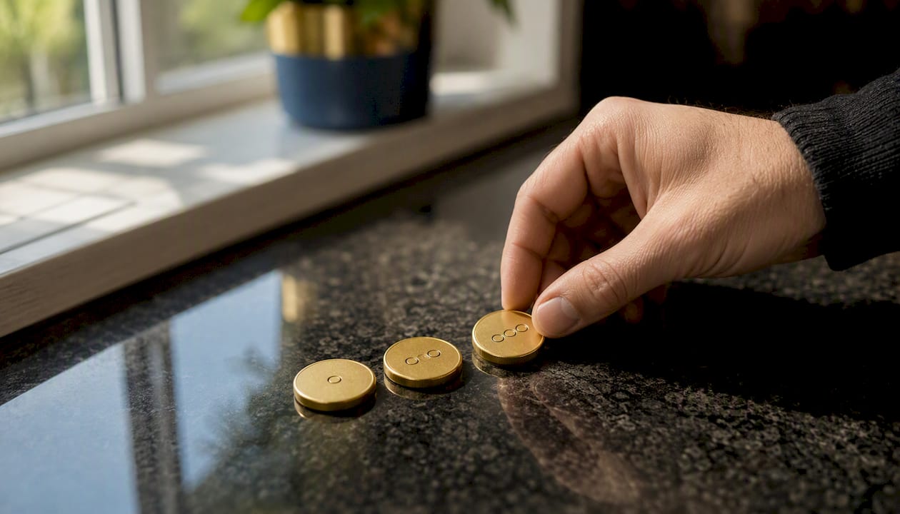
Industry practice around CTA design points to the same pattern: multiple, context-appropriate next steps increase the odds that any given visitor engages at their comfort level, rather than bouncing because the only option feels too big a commitment. A visitor doing early research wants a guide or a calculator. A visitor actively comparing vendors wants a demo or a quote. A visitor who just needs a quick answer wants chat. One CTA can’t serve all three.
A working implementation pattern:
Primary CTA: the highest-intent action (demo, quote, trial), placed above the fold and repeated once further down the page.
Secondary self-serve option: a calculator, pricing page, or interactive tool that lets visitors get value without talking to anyone yet.
Low-commitment micro-conversion: a downloadable guide or short video that captures an email address in exchange for something genuinely useful.
Proof gate: case studies or testimonials placed right before a conversion point, since visitors often want validation right when they’re about to commit.
A B2B software company selling to operations teams might run a homepage with “Get a Custom Quote” as the primary CTA, a free ROI calculator as the secondary path, and a “5 Signs You’ve Outgrown Spreadsheets” download as the micro-conversion. Each path captures a different visitor at a different readiness level, instead of losing the two-thirds who weren’t ready for the big ask.
To map layered paths to visitor intent on your own homepage, ask three questions for each traffic segment: what do they already know, what decision are they trying to make, and what’s the smallest next step that moves them forward without asking for more trust than they’ve earned yet.
Measuring Homepage Lead Capture and Running Real Experiments
Conversion rate alone tells you almost nothing useful about a homepage, especially in a B2B sales cycle that stretches weeks or months. By the time a lead closes, you’ve forgotten which headline they saw. That’s why B2B homepage optimization should lean on leading indicators rather than waiting on the lagging metric of closed deals.
Track these signals weekly, not quarterly:
Time on page and scroll depth — tells you whether visitors are actually reading your value proposition or bouncing before they reach it.
CTA click rate by position — reveals whether your primary CTA above the fold is doing more work than the one further down, or vice versa.
Micro-conversion rate — downloads, calculator completions, and chat starts, tracked separately from your main form.
Bounce rate by section — using scroll-tracking tools to see exactly where visitors give up, rather than treating the whole page as one number.
Set up event tracking for each of these specifically: clicks on the primary CTA, downloads of any lead magnet, chat widget opens, form submissions, and URL fragment changes if your homepage uses in-page anchors for navigation. Without this instrumentation, you’re optimizing blind.
When you run an A/B test, structure it the same way every time: write a specific hypothesis (“naming the buyer in the headline increases CTA click rate”), pick one metric to judge it by, and don’t call a result until you’ve got enough traffic to trust it statistically rather than eyeballing a week of data. Leading indicators like click rate and scroll depth will move faster than pipeline numbers, so use them to kill or confirm a hypothesis quickly, then let the lagging metrics validate it over the following month. High bounce rates specifically tend to trace back to above-the-fold clarity problems, so treat bounce rate as your first diagnostic, not an afterthought.
Ten Homepage Fixes to Make This Week
Prioritize by effort versus impact. Most of these take under a day.
Rewrite the headline to name your buyer (2 to 3 hours). This alone often produces the biggest single lift in perceived relevance.
Add a secondary, low-friction CTA next to your primary one (1 to 2 hours). Give hesitant visitors somewhere to go besides “leave.”
Cut your form down to 3 fields or fewer (1 hour). Remove anything you don’t need for the first follow-up.
Add one specific proof point above the fold (2 hours). A client logo strip or a single named result beats a vague “trusted by many” line.
Test your CTA button on an actual phone (30 minutes). Fix thumb-reach and tap-target size issues immediately.
Remove any auto-rotating carousel above the fold (1 hour). Static content converts better than a slideshow visitors have to wait through.
Add inline form validation (half a day, dev time). Stops silent abandonment when a field fails on submit.
Check page load speed and compress oversized hero images (2 to 4 hours). A slow hero section defeats every other fix on this list.
Add one micro-conversion offer like a short guide or calculator (1 to 2 days to build, if you don’t have one yet).
Run the 5-second test with five people outside your company (1 hour). Ask what you do and who it’s for; fix whatever confuses them.
Once the checklist is live, run one A/B test before adding anything else: your original headline against a version that explicitly names the buyer segment. It’s the single highest-leverage, lowest-effort test on this list, and it tells you fast whether messaging or design is your actual bottleneck.
What We See Break on B2B Homepages, Over and Over
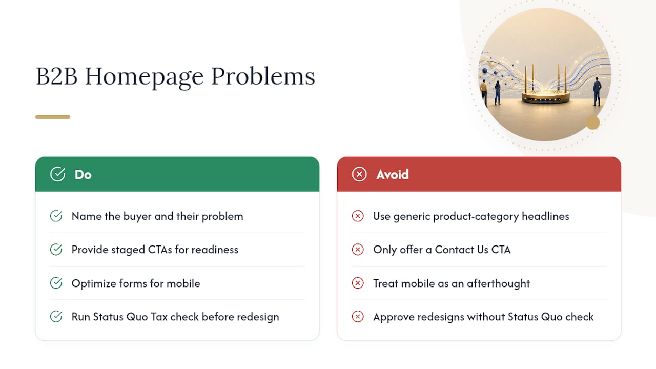
The same three mistakes show up on client homepage audits with almost boring consistency. First, weak above-the-fold messaging: headlines that describe a product category instead of naming the buyer and their problem. Second, a single binary CTA, usually “Contact Us” or “Book a Demo,” with no path for the visitor who isn’t ready for that ask yet. Third, mobile treated as an afterthought, where a form that works fine on a laptop becomes a frustrating scroll-and-pinch exercise on a phone.
One pattern worth calling out specifically: a homepage rewritten to replace a generic “Solutions for Your Business” headline with language naming the exact buyer and their situation typically sees engagement signals like scroll depth and CTA clicks improve within days, well before any pipeline change shows up. That gap between quick signal and slow outcome is exactly why leading indicators matter more than founders usually assume during a redesign.
The uncomfortable truth is that most homepage problems aren’t design problems at all. They’re messaging problems wearing a design costume. Teams spend weeks on layout and color when the actual issue is that nobody outside the company can tell what the business does in under five seconds.
Pro Tip: Before approving any visual redesign, run what we’d call the Status Quo Tax check: does your copy explain what it costs the visitor to keep doing nothing? Homepages that skip this almost always underperform on urgency, regardless of how polished they look.
Get a Homepage and Lead Capture Audit Built for B2B
Most of the fixes above take a day or two to implement, but knowing which ones matter most for your specific traffic mix takes outside eyes. Flockleads runs homepage and lead capture audits specifically for B2B companies, mapping your current above-the-fold messaging, CTA structure, and form friction against what your actual traffic sources need.
The audit identifies where visitors are dropping off, whether your homepage is trying to do a landing page’s job (or the reverse), and which of the fixes above would move your numbers fastest. Flockleads builds and manages ongoing lead generation campaigns for B2B companies across paid channels and organic search, so the audit isn’t theoretical. It’s built on what actually converts traffic once it lands. If you’re not sure whether your current site is converting the traffic you already have, start with a free audit and get a specific list of what to fix first.
Sources
Frequently asked questions
What is the purpose of a homepage?
A homepage’s purpose is to act as an elevator pitch and routing hub. It tells visitors who you are, what you offer, and what to do next, then sends different visitors toward the path that fits their intent.
What is the role of homepage in lead capture specifically?
The homepage captures leads by pairing clear, buyer-centered messaging with layered conversion paths, so visitors at different readiness levels each find a next step, from a low-commitment download to a direct quote request.
What is the purpose of a landing page?
A landing page exists to convert one specific audience toward one specific offer, stripping out the navigation and competing options a homepage needs to serve everyone.
How can I capture leads from my website?
Start by naming your audience in the homepage headline, then add at least one secondary CTA and one micro-conversion, such as a guide or calculator, alongside your primary form so visitors who aren’t ready to buy still have a way to engage.
Should paid ad traffic go to my homepage or a landing page?
Paid ad traffic tied to one specific offer converts better on a dedicated landing page built around that exact promise, while broader or branded traffic is better served by the homepage’s wider routing function.
NEED A CLEARER PLAN?
Let’s turn your next move into momentum.
Talk to us →