THE SHORT ANSWER
A call to action (CTA) is the single most direct mechanism for converting website visitors into qualified leads. The role of CTAs in lead generation is not decorative. Every button, link, or prompt you place on a page either moves a prospect forward or lets them drift away. Research shows that personalized CTAs convert 42% more than generic ones. That gap represents real pipeline.
A call to action (CTA) is the single most direct mechanism for converting website visitors into qualified leads. The role of CTAs in lead generation is not decorative. Every button, link, or prompt you place on a page either moves a prospect forward or lets them drift away. Research shows that personalized CTAs convert 42% more than generic ones. That gap represents real pipeline. For B2B marketers, where each lead carries significant revenue potential, CTA copy, design, and placement are not afterthoughts. They are the architecture of your conversion funnel.
How do CTAs influence lead generation outcomes?
CTAs reduce decision friction by giving visitors an explicit next step. Without a clear prompt, even interested prospects stall. The mechanism is simple: a well-written CTA removes ambiguity and lowers the mental cost of acting.
Psychological triggers are the engine behind high-converting CTAs. Four levers matter most: specificity, urgency, curiosity, and value framing. CTAs that activate all four levers convert 3.1 times higher on average than those using only one. That is not a marginal difference. It means a page generating 100 leads per month could generate 310 with the same traffic.

First-person language is one of the fastest wins available. Changing “Get your free template” to “Get my free template” creates a sense of ownership before the visitor even clicks. First-person CTA copy lifts click-through rates by 90% in tested B2B contexts. The psychological reason is straightforward: “my” signals that the outcome already belongs to the reader.
Microcopy placed near the CTA button also shapes behavior. Phrases like “No credit card required” or “Cancel anytime” directly address commitment anxiety. Anxiety-reducing microcopy increases sign-ups by 12%. That lift costs nothing to implement and requires no redesign.
Specificity: “Download the 2026 B2B Pricing Report” outperforms “Download Now” because it tells the visitor exactly what they receive.
Urgency: Time-bound language (“Available this week”) accelerates decisions without feeling manipulative when the offer is genuine.
Curiosity: Framing the CTA as a question or partial reveal (“See what’s slowing your pipeline”) pulls readers forward.
Value framing: Leading with the benefit rather than the action (“Save 5 hours a week. Start free.”) shifts focus to the outcome.
What are the best practices for CTA copywriting and design?
Strong CTA copy always starts with a verb. “Get,” “Start,” “Try,” “See,” and “Download” are direct and action-oriented. Weak openers like “Submit” or “Click here” tell the visitor nothing about what they gain. Removing “Submit” from a form button and replacing it with a benefit-driven verb is one of the fastest conversion improvements available.
First-person wording outperforms second-person in nearly every B2B test. “Start my free trial” consistently beats “Start your free trial.” Changing to first-person copy doubled click-through rates in documented tests. The shift is two words. The impact is not.
CTA length should be short and specific. Three to seven words is the practical range. Longer CTAs dilute the action signal. Shorter ones often lack enough context to communicate value. “Get my lead generation audit” hits the sweet spot: it names the action, the ownership, and the deliverable.
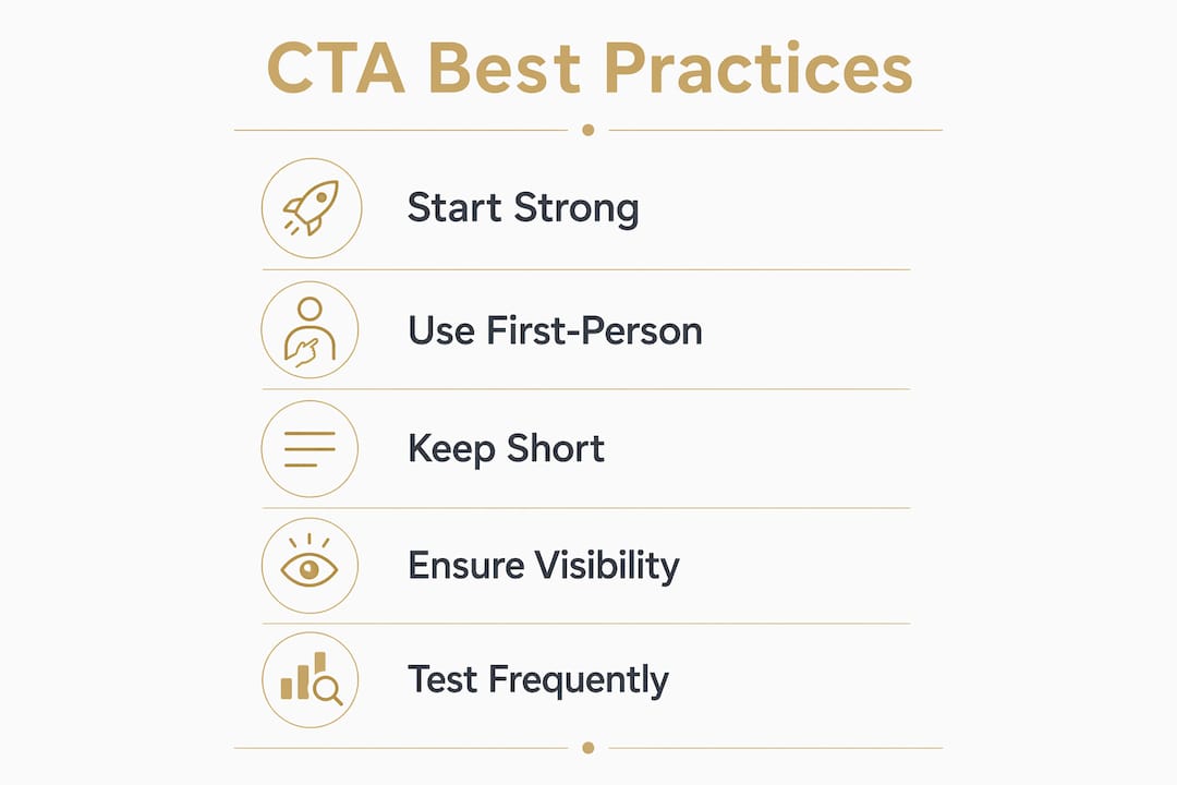
Visual design determines whether your CTA gets seen at all. The Web Content Accessibility Guidelines (WCAG) AA standard requires a 4.5:1 contrast ratio for text against its background. Meeting this standard is not just an accessibility requirement. It also makes your button visually dominant on the page, which directly supports conversion.
Pro Tip: Test your CTA button color against your page background using a free contrast checker before launch. A button that fails WCAG AA is invisible to a meaningful share of your audience.
Placement is as important as copy. The right CTA in the wrong location converts poorly.
Hero placement: Works for warm audiences who arrive with high intent. Cold traffic needs more context first.
Mid-page placement: Mid-page CTAs placed after value demonstration convert 220% better than hero-only CTAs for complex B2B products.
Sticky CTA: A button that remains visible during scrolling increases mobile conversions by 17% without raising bounce rate.
Exit intent: Captures visitors who are about to leave. Works best with a low-commitment offer.
Footer: Useful for visitors who read everything and need one final prompt.
How to tailor CTAs to each stage of the buyer journey
The buyer journey in B2B follows three broad stages: top of funnel (TOFU), middle of funnel (MOFU), and bottom of funnel (BOFU). Each stage carries a different level of intent, and mismatching your CTA language to the wrong stage is one of the most common and costly errors in B2B marketing.
Cold traffic at the TOFU stage has not yet decided they have a problem worth solving. Asking them to “Book a demo” or “Get a quote” at this stage triggers what researchers call the commitment trap. The visitor feels pressured before they feel understood, and they leave. Low-commitment CTA language like “See if we can help” lifts inquiries by 38% compared to “Get a quote” on cold traffic pages. That single word change signals empathy rather than urgency.
MOFU visitors are evaluating options. They know their problem and are comparing solutions. CTAs at this stage should offer specific value: a comparison guide, a case study, or a diagnostic tool. The language can be slightly more direct because the visitor has already invested time in research.
BOFU visitors are ready to act. Direct CTAs work here. “Start my free trial,” “Book a 20-minute call,” or “Get my custom proposal” all perform well because the visitor’s intent matches the commitment level of the offer.
Funnel stage | Visitor intent | CTA example | Approach |
|---|---|---|---|
TOFU | Low, exploring | “See if we can help” | Low commitment, empathy-first |
MOFU | Medium, evaluating | “Download the comparison guide” | Specific value, no pressure |
BOFU | High, deciding | “Book my 20-minute call” | Direct, benefit-led, first-person |
Using BOFU language on a TOFU page does not just fail to convert. It actively reduces trust. Visitors read aggressive CTAs as a signal that the company prioritizes its own goals over the visitor’s needs. Aligning CTA language with funnel stage is one of the highest-leverage adjustments in effective lead generation strategies.
What metrics and testing methods improve CTA performance?
Measuring CTA performance requires tracking four core metrics: click-through rate (CTR), conversion rate, hover-to-click ratio, and time-to-click. CTR tells you how many visitors clicked. Conversion rate tells you how many of those clicks became leads. Hover-to-click ratio reveals hesitation. Time-to-click shows whether your CTA is being read or ignored.
A/B testing is the standard method for improving CTAs with confidence. The process requires discipline on sample size. Detecting a 20% improvement with 95% statistical confidence requires approximately 2,000 visitors per variant. Running a test on 200 visitors and declaring a winner is a common mistake that produces false conclusions and wasted changes.
Define one variable. Test copy, color, or placement. Never test all three at once.
Set your sample size before you start. Calculate the traffic needed to reach significance, then wait.
Use heatmaps and scroll depth data. Behavioral analytics from tools like Microsoft Clarity reveal where visitors stop reading and whether they ever reach your CTA.
Track hover-to-click ratio. A high hover rate with low clicks signals that the copy is not matching visitor expectations.
Compound your wins. A 20% lift in CTR combined with a 15% lift from copy changes compounds across your full funnel, not just one page.
Pro Tip: Run qualitative research alongside A/B tests. Ask five real prospects to narrate their experience clicking through your page. Their hesitations will reveal what the data cannot.
Heuristic analysis is a fast alternative when traffic is too low for A/B testing. Reviewing your CTA against known conversion principles, such as specificity, clarity, and commitment level, surfaces obvious problems without waiting for statistical significance. Flockleads uses this approach when auditing lead flows for service businesses with limited monthly traffic.
Key Takeaways
CTAs are the primary conversion mechanism in any B2B lead generation funnel, and small copy or placement changes produce measurable, compounding results.
Point | Details |
|---|---|
First-person copy lifts CTR | Switching to “my” language increases click-through rates by up to 90% in B2B tests. |
Funnel stage alignment is critical | Using BOFU language on cold traffic pages reduces trust and kills conversions. |
Mid-page placement outperforms hero-only | Placing CTAs after value demonstration converts 220% better for complex B2B products. |
Microcopy reduces commitment anxiety | Phrases like “No credit card required” increase sign-ups by 12% at no design cost. |
Testing requires adequate sample size | A/B tests need approximately 2,000 visitors per variant to detect a 20% improvement reliably. |
Why most CTA advice misses the point
Most CTA guides hand you a list of power words and call it a day. That approach treats CTAs as isolated buttons rather than as moments in a conversation. The visitor arriving on your page has a specific concern, a specific level of trust, and a specific tolerance for commitment. A CTA that ignores all three of those factors will underperform no matter how well-written the button text is.
The insight I keep returning to is this: the best CTAs feel inevitable. When the copy, the offer, and the visitor’s state of mind are aligned, clicking feels like the natural next move rather than a decision. That alignment does not come from a formula. It comes from understanding your visitor well enough to anticipate what they need to hear at that exact moment.
Decision paralysis is real and underappreciated. Pages with three or more competing CTAs consistently perform worse than pages with one clear primary action. Every additional option you add forces the visitor to make a choice they did not come to your page to make. Pick one primary CTA per page and make it the obvious next step.
Quantitative data tells you what is happening. Qualitative research tells you why. The teams I have seen produce the best CTA results are the ones who combine heatmap data with actual conversations with prospects. They do not guess at hesitation. They ask. That combination of numbers and empathy is what separates consistently high-converting funnels from ones that plateau after the first round of tests. For B2B marketers who want to turn paid traffic into leads, this discipline is non-negotiable.
— Mieke
How Flockleads engineers lead flow with optimized CTAs
Getting CTA strategy right across an entire B2B website is harder than it looks. Copy, placement, funnel stage alignment, and continuous testing all need to work together. Most marketing teams get one or two of those right and leave the rest to chance.
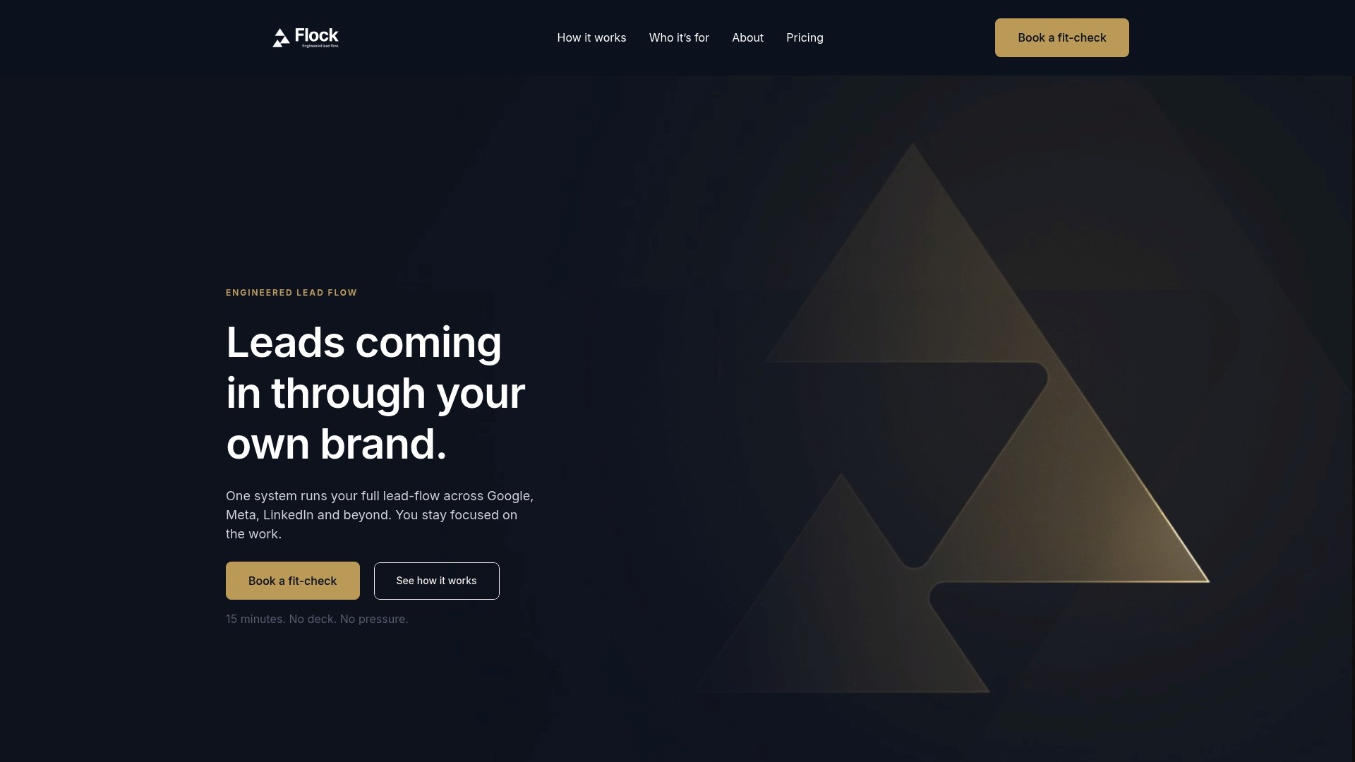
Flockleads builds engineered lead flows for service businesses that treat CTAs as a system, not a checklist. Every CTA in a Flockleads funnel is matched to visitor intent, tested against behavioral data, and refined over time. The result is a predictable, growing stream of qualified leads to your website rather than a one-time conversion bump. If your current CTAs are not producing the lead volume your business needs, see how Flockleads works and what a structured approach looks like in practice.
Frequently asked questions
What is the role of CTAs in lead generation?
A CTA is the prompt that converts a website visitor into a lead by directing them toward a specific action. Without a clear CTA, even high-intent visitors leave without engaging.
How does CTA copy affect conversion rates?
First-person copy like “Get my free audit” outperforms second-person copy by up to 90% in B2B tests. Specificity and benefit-led language reduce hesitation and increase clicks.
Where should CTAs be placed on a B2B page?
Mid-page CTAs placed after value demonstration convert 220% better than hero-only placements for complex B2B products. Sticky CTAs also lift mobile conversions by 17%.
How many CTAs should a page have?
One primary CTA per page produces better results than multiple competing options. Additional CTAs create decision paralysis and reduce overall conversion rates.
How do I know if my CTA is working?
Track click-through rate, conversion rate, and hover-to-click ratio. Run A/B tests with at least 2,000 visitors per variant to detect meaningful differences with statistical confidence.
NEED A CLEARER PLAN?
Let’s turn your next move into momentum.
Talk to us →