THE SHORT ANSWER
A contact form strategy is a deliberate plan that aligns your form’s design, fields, placement, and automation to a single business goal. Not “get more submissions.” One specific goal: volume, quality, or support resolution.
A contact form strategy is a deliberate plan that aligns your form’s design, fields, placement, and automation to a single business goal. Not “get more submissions.” One specific goal: volume, quality, or support resolution.
Here is why that distinction matters. A form with no strategy is just a box on a page. A form with a strategy is a conversion asset tied directly to a sales or marketing KPI. The difference shows up in your pipeline within weeks.
Three actions you can take in the next 15 minutes:
Write a one-sentence form brief: “This form is for [audience] to [take action] so we can [business outcome].” Pin it above your form builder before touching a single field.
Cut every field that does not help you act on the lead within 48 hours. Phone number, company size, budget range — if you cannot use it to route or respond faster, remove it.
Add a confirmation message that answers three questions: Did it work? What happens next? How long will it take?
That is the skeleton. The rest of this guide puts muscle on it.
Why your contact form is a conversion asset, not a courtesy feature
Most B2B websites treat the contact form as an afterthought. It sits in the footer, asks for twelve fields, and sends an email to a generic inbox. Nobody follows up within the hour. The lead goes cold.
The business cost is real. Reducing fields from 11 to 4 can increase conversions by roughly 120%, and each unnecessary field tends to cost about 10–15% in completion rate. That is not a design problem. It is a revenue problem.
When you treat a form as a strategic asset, three things change. Conversion rates climb because friction drops. Lead quality improves because the right qualifying questions replace the wrong curiosity questions. And time-to-contact shrinks because routing rules fire automatically instead of waiting for someone to read an email.
For B2B companies running paid ads on Meta, LinkedIn, or Google, the form is the last gate before a lead enters your CRM. If that gate is broken or misaligned, every dollar spent on traffic is partially wasted. Contact form best practices are not a UX nicety; they are a budget protection measure.
How to choose your primary goal before you build anything
The single biggest mistake in form design is trying to serve multiple goals at once. A form that wants volume AND deep qualification AND support routing will do none of them well. Pick one primary goal, then design everything else around it.
Primary Goal | When to Use It | Recommended Field Depth | Key Trade-Off |
|---|---|---|---|
Lead volume | Paid traffic, top-of-funnel pages, blog CTAs | 2–3 fields (name, email, one qualifier) | More submissions, lower average quality |
Lead quality | Pricing pages, demo requests, enterprise sales | 4–6 fields with conditional logic | Fewer submissions, higher close rate |
Support routing | Help center, post-purchase pages, client portals | 3–5 fields with category dropdown | Speed of resolution vs. completeness of ticket |
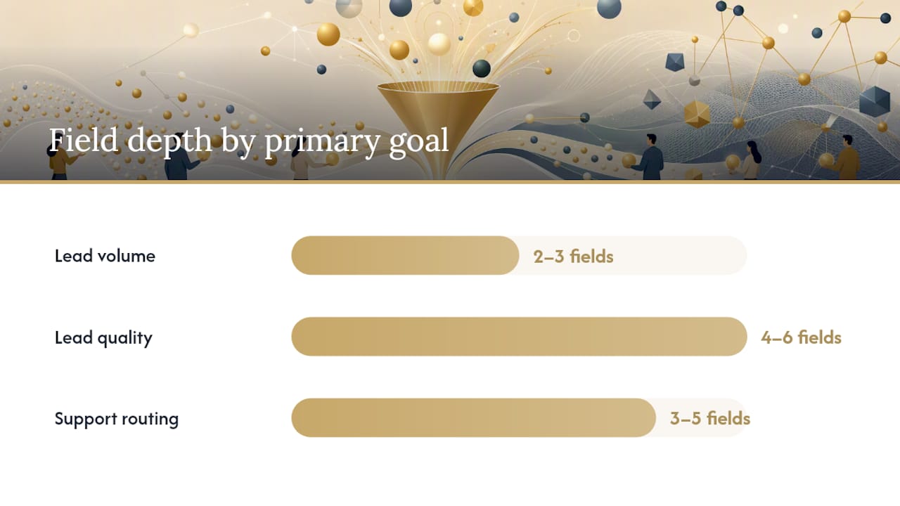
Page placement changes the equation. A form on a blog sidebar should ask for almost nothing; the reader is still browsing. A form on a pricing page can ask for company size and use case because the visitor is already evaluating you. Match field depth to buyer intent, not to what your sales team wishes they knew.
For a B2B SaaS company running Google Search ads, a short volume-capture form on the landing page makes sense for the first click. For an enterprise software firm targeting CFOs, a longer qualification form on the demo page is appropriate because the sales cycle justifies the friction. Form placement affects expected commitment, so field depth should follow page intent.
Which form type fits your goal?
Once you have a goal, the form type follows naturally. Here is a quick breakdown.
Single-step forms The default. All fields visible at once. Best for low-friction goals (newsletter, quick quote, contact us). Fast to build, easy to test.
Pros: low perceived effort, familiar to users, easy to A/B test
Cons: field count is immediately visible, which can intimidate
Multi-step forms Questions split across two or more screens. Each step feels lighter. Works well for B2B demo requests and quote flows where you need 5+ fields.
Pros: higher completion on longer forms, natural qualification checkpoint between steps
Cons: more complex to build, requires clear progress indicators
Conditional logic forms Fields appear or hide based on previous answers. A visitor who selects “Enterprise” sees a budget field; one who selects “Startup” does not. This is the most efficient way to collect qualifying data without scaring off early-stage leads.
Pros: personalized experience, collects more data without adding visible length
Cons: requires a capable form builder (Typeform, Jotform, HubSpot Forms, Gravity Forms)
Conversational forms One question at a time, chat-style. High engagement for cold audiences. Popular on landing pages for high-ticket offers.
Pros: feels less like a form, strong for mobile, good completion on longer flows
Cons: slower to complete, can feel gimmicky if the offer does not justify it
Popup and slide-in forms Triggered by scroll depth, exit intent, or time on page. Useful for capturing leads from blog readers who would otherwise leave without converting.
Pros: catches passive visitors, easy to add to existing pages
Cons: can hurt UX if triggered too aggressively; test timing carefully
For B2B lead generation specifically, multi-step and conditional forms tend to outperform single-step forms on high-intent pages. Progressive disclosure, showing extra questions only after a qualifying choice, keeps first-step friction low while still collecting the data your sales team needs.
What to ask and how to ask it: field templates for B2B goals
The principle is simple: ask only what you need to take the next action within 48 hours. Separate routing fields (company size, use case) from curiosity fields (how did you hear about us, annual revenue). Routing fields stay. Curiosity fields go.
Demo request (minimal)
First name
Work email
Company name
What are you trying to solve? (dropdown: 3–4 options)
CTA: “Book my demo”
Demo request (expanded, for enterprise)
Full name
Work email
Company name
Company size (dropdown)
Current solution (short text or dropdown)
Timeline (dropdown: within 30 days / 1–3 months / exploring)
CTA: “Request a demo”
Quote request
Name
Email
Service needed (dropdown)
Project description (short text, 2–3 lines max)
CTA: “Get a quote”
Support ticket
Name
Email
Issue category (dropdown)
Description (textarea)
CTA: “Submit request”
For CTA copy, action-oriented labels outperform generic ones. “Get a quote” converts better than “Submit.” “Book my demo” converts better than “Send.” Put labels above fields, not inside them as placeholder text, because placeholder text disappears the moment someone starts typing and creates confusion on mobile.
Place a short trust line near the email field: “No spam. We respect your inbox.” One sentence. It reduces hesitation without cluttering the form. Near the CTA, add a response-time claim: “We reply within one business day.” That small addition removes a common objection before it forms.
UX and technical checklist: what kills conversions before the submit button
Good form strategy falls apart at the technical layer more often than at the strategy layer. Here is what to check.
Mobile and layout
Single-column layout only; two-column forms break on small screens
Tap targets at least 44px tall for every input and button
Use appropriate input types:
emailfor email,telfor phone,numberfor numeric inputs (triggers the right mobile keyboard)Font size 16px minimum to prevent iOS from auto-zooming
Validation and errors
Validate on blur (when the user leaves a field), not on every keystroke
Show inline error messages directly below the relevant field, not at the top of the form
Preserve user input on server errors; never clear a completed form because of a backend failure
Avoid harsh real-time validation on long text fields
Spam protection
Honeypot fields (hidden inputs bots fill in, humans do not) catch most automated spam without friction
Rate limiting blocks repeated submissions from the same IP
Use CAPTCHA selectively, only on high-spam forms, because it adds friction for real users
Confirmation experience A confirmation must answer three questions: Did it work? What happens next? How long will it take?. A redirect to a thank-you page is better than an inline message because it fires a clean conversion event in Google Analytics and Google Ads, and it gives you space to set expectations and offer a next step (download a resource, book a call directly).
Pro Tip: Place your privacy reassurance line and response-time claim directly above the submit button, not buried in footer text. Visitors read the area around the CTA before they click. That is where trust signals do the most work.
Integrations and automation: making every submission immediately actionable
A form that emails a PDF to a shared inbox is not a strategy. The submission needs to trigger a chain of events automatically.
Core integrations to connect
CRM integration is non-negotiable for B2B. Whether you use Salesforce, HubSpot, Pipedrive, or Zoho CRM, every submission should create a contact and a deal record instantly. Manual data entry between form and CRM is where leads die.
Calendar booking tools like Calendly or HubSpot Meetings can replace the “we’ll be in touch” confirmation entirely. After a demo request, redirect to a booking page. Time-to-contact drops from hours to seconds.
Enrichment tools like Clearbit or Apollo.io can append company data (industry, headcount, revenue range) to a submission using only the email address. Your sales team sees a fuller picture before the first call without asking the prospect for more fields.
Ticketing integrations (Zendesk, Freshdesk, Intercom) are the right destination for support forms. Routing a support submission to a CRM deal is a category error that slows resolution.
Routing rules and conditional workflows
Not every lead should go to the same person. Set routing rules based on company size, geography, or use case. A submission from a company with 500+ employees routes to enterprise sales. A submission from a solo founder routes to a self-serve onboarding sequence. This is where qualifying multi-step forms fit into lead-generation funnels for service businesses.
Example automation flow
Visitor submits demo request form
CRM creates contact and deal; enrichment tool appends company data
Routing rule assigns deal to the correct sales rep based on company size
Autoresponder sends a confirmation email with a calendar booking link
Sales rep receives a Slack or email notification with the enriched lead profile
If no meeting booked within 24 hours, a follow-up sequence triggers automatically
That entire flow runs without a human touching it. The sales rep’s first action is the actual conversation.
How to measure and test your form: KPIs and experiments that move results
You cannot improve what you do not measure. Track form views versus submissions and run single-variable A/B tests to iterate. Here are the metrics that matter.
KPIs to track
Form view-to-submission rate (your primary conversion metric)
Qualified lead rate (submissions that meet your ICP criteria)
Time-to-contact (minutes from submission to first sales touchpoint)
Spam rate (submissions that are clearly not real leads)
Form abandonment rate (started but not submitted)
Benchmarks
Metric | Typical Range | Notes |
|---|---|---|
Form conversion rate | 1%–5% of page visitors | Varies widely by page type and traffic source |
Field reduction impact | Roughly 120% conversion lift | Going from 11 fields to 4 (Antforms data) |
Mobile abandonment | Higher than desktop | Single-column layout reduces this gap |
Time-to-contact target | Under 5 minutes | Leads contacted within 5 minutes are significantly more likely to convert |
A/B test ideas, one variable at a time
CTA button copy: “Get a quote” vs. “Request pricing” vs. “Talk to sales”
Field count: 3-field version vs. 5-field version for the same audience
Single-step vs. multi-step for a demo request on a pricing page
Form placement: above the fold vs. after the value proposition
Confirmation: inline message vs. redirect to a thank-you page
For tracking, fire a custom event in Google Tag Manager on form submission. Capture UTM parameters in hidden fields so every lead in your CRM carries its traffic source. That data tells you which campaigns produce leads that actually close, not just leads that submit.
For improving landing page conversion rates, form changes and page-level changes work together. Test them separately so you know which lever moved the needle.
Compliance and privacy: what U.S. businesses need on their forms
U.S. privacy law is a patchwork, not a single federal standard. California’s CCPA (California Consumer Privacy Act) is the most comprehensive state law and effectively sets a floor for businesses that serve California residents, which is most online businesses.
What to include near your form
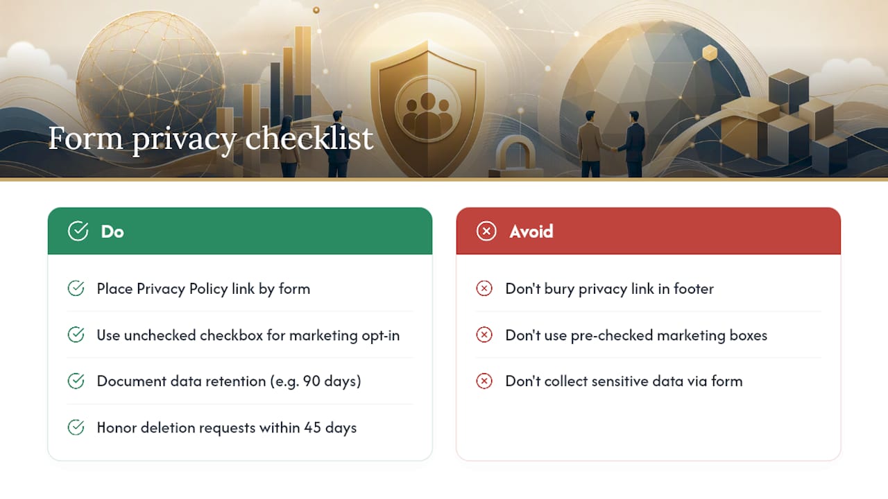
Link to your privacy policy near the email field or the submit button. The link text should be clear: “Privacy Policy” or “How we use your data.” Do not bury it in footer legalese. The form is where data collection happens; that is where the disclosure belongs.
For email marketing opt-ins, add an unchecked checkbox with explicit consent language: “I agree to receive marketing emails from [Company]. You can unsubscribe at any time.” Pre-checked boxes do not constitute valid consent under most frameworks.
Data handling basics
Keep form data only as long as you need it. Define a retention period (90 days for unqualified leads, for example) and document it. If a California resident requests deletion of their data under CCPA, you need a process to honor that request within 45 days.
For B2B forms where you are collecting business contact information, the consent requirements are lighter than for consumer marketing. Still, a clear privacy notice and an opt-out path are good practice and increasingly expected by sophisticated buyers.
Do not collect sensitive data (Social Security numbers, health information, payment details) through a standard contact form. Use purpose-built, compliant tools for those inputs.
This is general information, not legal advice. Confirm your specific obligations with a qualified privacy attorney or your state’s attorney general office.
Decision checklist and three B2B playbooks you can run this week
Decision checklist
Before building or rebuilding any form, answer these questions:
What is the single goal of this form? (volume / quality / support)
Who is the audience, and where are they in the buyer journey?
What is the minimum information needed to act within 48 hours?
Which form type fits the page and the goal?
Where does the submission go, and who owns the follow-up?
What does the confirmation experience tell the user?
Which KPI will you track to know if it is working?
Playbook 1: Fast volume capture for paid ads
Goal: Maximize submissions from Meta or Google ad traffic.
Use a single-step form with three fields: first name, work email, and one qualifying dropdown (e.g., “What best describes your business?”). Place it above the fold on a dedicated landing page. Connect to your CRM with an instant autoresponder. Redirect to a thank-you page that fires a conversion event. For Meta ad campaigns, this setup captures leads at the lowest cost per submission. Review lead quality weekly and adjust the qualifying dropdown options if too many unqualified leads come through.
Playbook 2: High-quality demo requests for enterprise sales
Goal: Book qualified demos with decision-makers at target accounts.
Use a two-step form. Step one: name, work email, company name. Step two (triggered after step one is complete): company size, current solution, and timeline. Connect to Salesforce or HubSpot with enrichment via Clearbit. Route submissions with 100+ employees to enterprise sales; route smaller companies to a self-serve sequence. Redirect to a Calendly booking page. Track qualified lead rate and time-to-first-meeting as your primary KPIs. B2B qualification requirements differ meaningfully from B2C, and this two-step approach reflects that.
Playbook 3: Support routing playbook
Goal: Route support requests to the right team without a human triage step.
Use a single-step form with a category dropdown (Billing, Technical, Account, Other), email, and description field. Connect to Zendesk or Freshdesk with routing rules that assign tickets by category. Send an automated confirmation with a ticket number and expected response time. Track resolution time and reopened ticket rate. Review category distribution monthly to spot recurring issues worth fixing at the product level.
Key Takeaways
A contact form strategy works when it ties one specific goal to the right form type, field set, and automation chain, then measures the result.
Point | Details |
|---|---|
Start with a form brief | Write one sentence defining audience, action, and business outcome before selecting any fields. |
Fewer fields convert better | Cutting from 11 fields to 4 can increase conversions by roughly 120%; remove anything you cannot act on within 48 hours. |
Match form type to goal | Use single-step for volume, multi-step or conditional for quality, category dropdowns for support routing. |
Automate the follow-up chain | Connect every form to a CRM, routing rule, and autoresponder so no submission waits for a human to forward an email. |
Flockleads applies this playbook | Flockleads builds qualifying form briefs, CRM integrations, and weekly optimization into its managed B2B lead generation service. |
The part most teams skip
Most teams spend weeks debating button color and zero minutes writing a form brief. The brief is the whole game. Once you know exactly who the form is for, what action you want them to take, and what your team does with the submission in the next hour, every other decision (field count, form type, CTA copy) becomes obvious.
The other thing worth saying plainly: forms are not outdated. Traditional long, impersonal forms underperform, but the answer is to redesign them, not abandon them. A well-designed form on a high-intent page still outperforms a chatbot for B2B lead capture because it is asynchronous, low-pressure, and easy to complete on a phone between meetings. The problem has never been the form itself. It has been the absence of a strategy behind it.
What usually changes after a team fixes its form strategy is not dramatic. Conversion rate goes up modestly. Lead quality improves noticeably. Sales follow-up gets faster. None of it is magic. It is just the result of treating a form as a deliberate piece of a sales system rather than a checkbox on a website launch list.
Further reading and authoritative sources
Frequently asked questions
What is a contact form strategy?
A contact form strategy is a plan that aligns a form’s goal, fields, placement, and automation to a single business outcome, such as capturing qualified leads or routing support requests. It treats the form as a conversion asset rather than a static page element.
What is the purpose of a contact form?
A contact form gives visitors a structured way to reach a business while giving the business control over what information it collects and how it routes that information. For B2B companies, it is the primary mechanism for capturing and qualifying inbound leads.
Are contact forms outdated?
No. Long, impersonal forms with too many fields underperform, but a well-designed form matched to user intent still converts reliably. The format needs to evolve (shorter, mobile-first, with conditional logic), not disappear.
How does a contact form work in a B2B lead generation flow?
A visitor submits the form, which triggers a CRM entry, a routing rule, and an automated confirmation. The assigned sales rep receives a notification with the lead’s details and ideally a calendar booking link, reducing time-to-contact to minutes rather than hours.
What makes a good contact form for lead generation?
A good lead generation form has a clear goal, three to five fields that qualify without overwhelming, action-oriented CTA copy, a trust line near the email field, and an automated follow-up chain connected to a CRM. Flockleads builds this setup as part of its managed B2B lead generation service.
NEED A CLEARER PLAN?
Let’s turn your next move into momentum.
Talk to us →